Nature Play
Website re-design.
Live site: Nature Play
Tools used: Photoshop, Illustrator, Omnigraffle, Sketching.
Description: It is a common trend that children often favor indoor inactivity as a means to spend their free time after school or on weekends. The more extreme side effects that parents are becoming concerned with are social disfunction and obesity. In order to increase awareness of this issue as well as providing positive solutions, I was asked to completely re-design the Nature Play website. I focused on creating a fun and enticing visual theme which focused on empowering parents with educational solutions.

Before and After
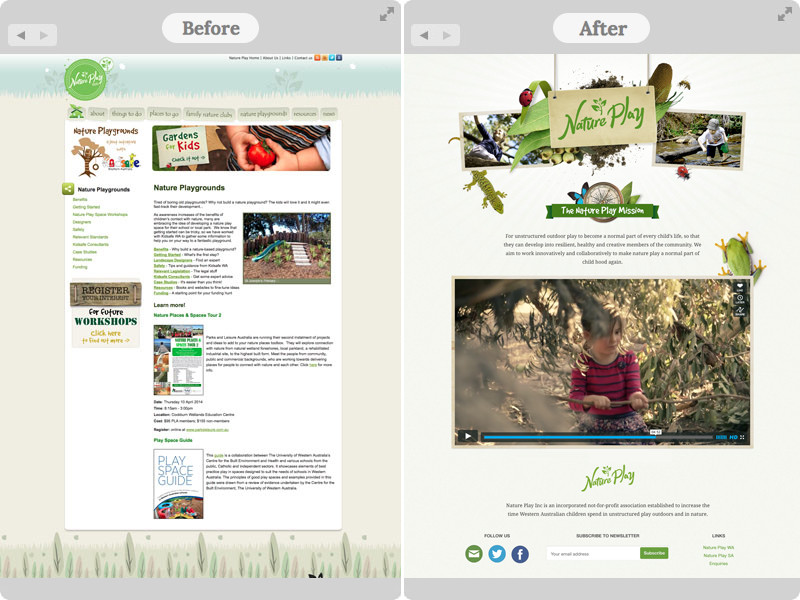
This is a sample of the previous website on the left and the new design on the right. The previous website was playful and served it's purpose, however, the client wanted a more mature, modern & cleaner design that utilized real images of nature to convey a more realistic and identifiable outdoor theme. I used a lot of naturural images of native flora and fauna while adding rustic elements such as mud and dirt to bond the user demographic to the design experience.
Mobile sketching
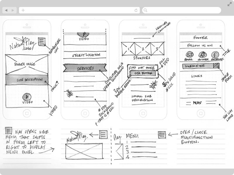
Before sketching the desktop experience, I start by creating mobile sketches to make sure the responsive experience is seamless across devices. By doing this I strip the content down to its bare minimum for the mobile device and then elaborate as needed for the wider devices and desktop browsers. This kept the content concise, relevant and allowed me, as the designer, to identify the user's needs without sacrificing the businesses goals and focus.
From sketching to wireframes
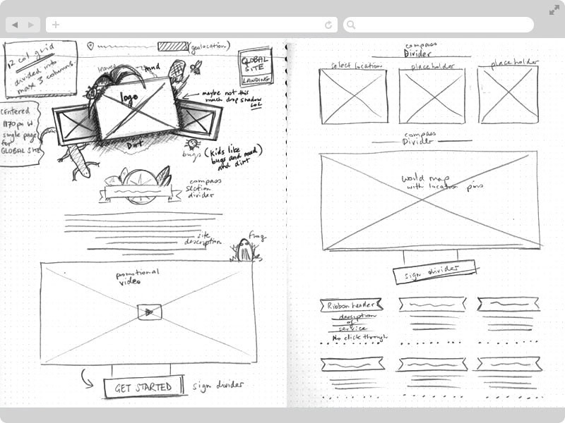
This is a rapid wireframe I created early in my discovery phase with the help of stakeholder feedback. The wireframe is created as blocks of content so that I could move parts around to establish a visual and contextual heirarchy of information. I believed that highlighting my client's branding was crucial in promoting the purpose of 'Nature Play' as well as in creating an easily identifiable link back to the organization. Parents, being the primary persona in this project, can only afford a small amount of time in their busy day, so I wanted to promote the logo and theme first before any other content. This way my client could secure a strong presence in the niche area of childhood devlopment that they were focusing on.
Wireframes for developers
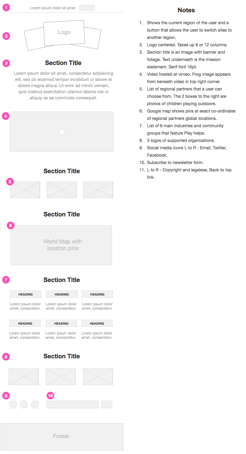
As part of my Agile UX process, I document my wireframes for the developer so that they have an understanding of the product's main features, interactions and architecture. As a front-end developer, I can sympathize and empathize for developers along the developement lifescycle. I usually spend a lot of time with the development team not only including them in on design workshops and discussions but I also include myself in their scrum meetings and sprint planning. By knowing what the developer's cycle and concerns are, I can iterate designs quicker and inform the client about technical possibilities and challenges.
User testing to inform design decisions
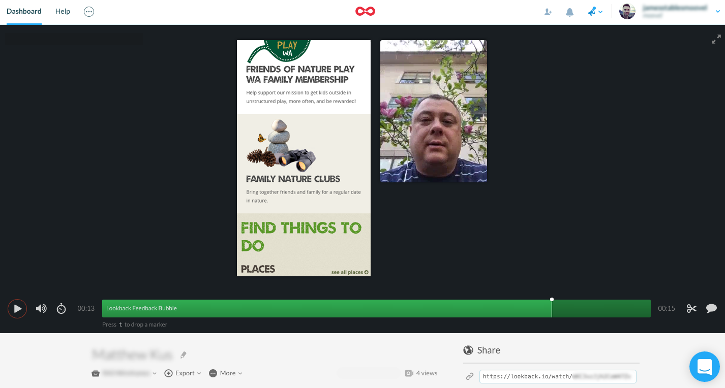
User testing Lo-Fi prototypes is an inexpensive way to obtain rapid feedback and helps keep the users and the business invested in the design phase. Based on user feedback and stakeholder meetings, I prototyped various layouts and user-tested many versions. This gave me direct feedback from which informed me how to structure my next round of designs.
By synthesizing the User Test results, I found patterns and trends which I recorded in a Google Sheet. From those patterns some of my assumptions were validated, some invalidated and I was able to rapidly focus my design iterations around the user's recurring painpoints blockers.
After 10 rounds of User Testing, Results Analysis and Design Iteration, the Wireframes were complete. Hi-Fi Designs were created in conjunction with a Design Guide and Modular Pattern Library of design assets. The hand over to the development team was a Waterfall process so heavy documentation was created to explain and illustrate every element and concept of the design. Included in the hand-off document were error states, validation alerts, 12 column grid specifications and device break points.
