
Mobility App
for Moovel North America
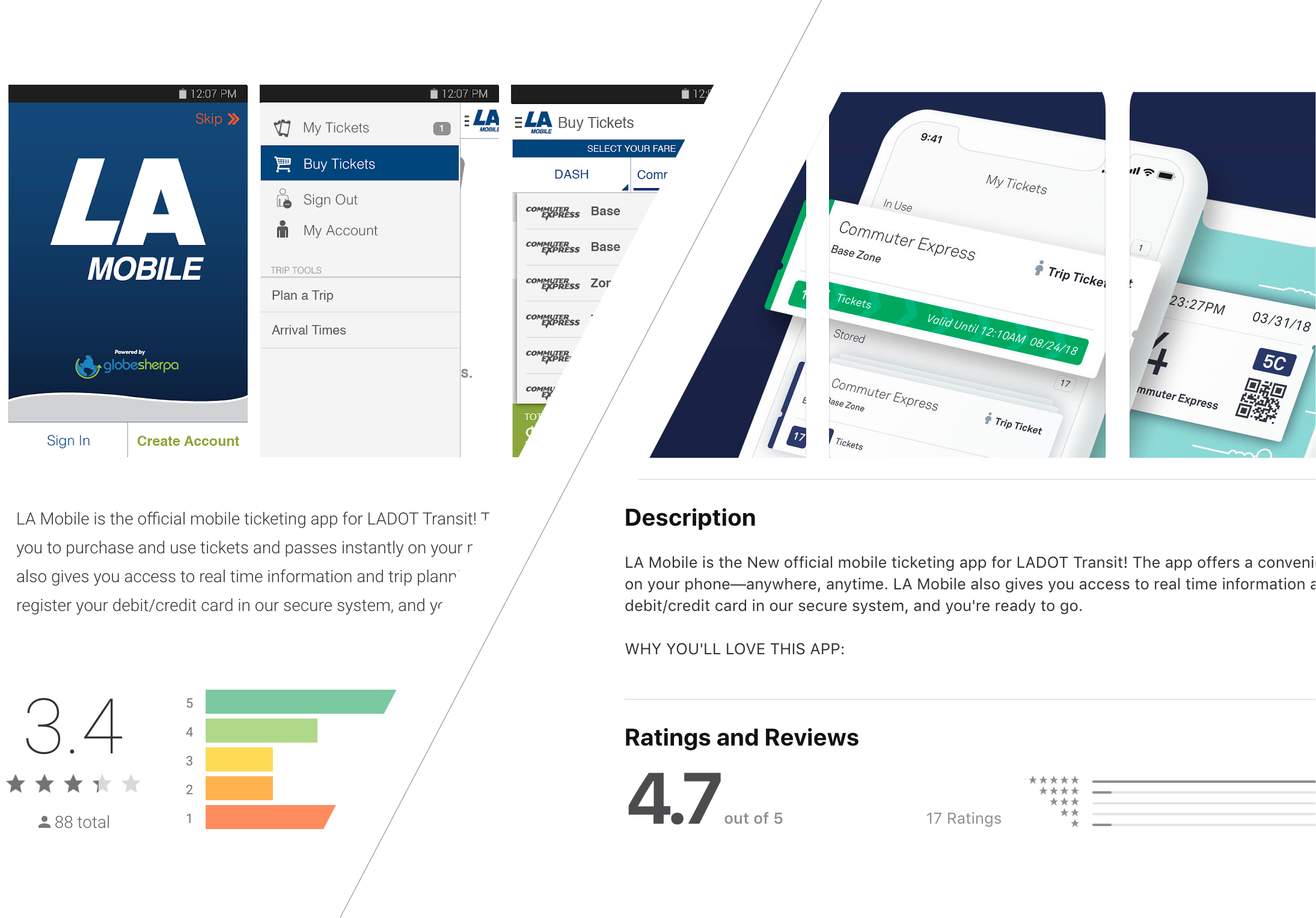
ROI: The App gained 1.3 stars in the App Store within the first month of launch. This is a ROI that we can proove to be the result of user centered research, strategy and design.
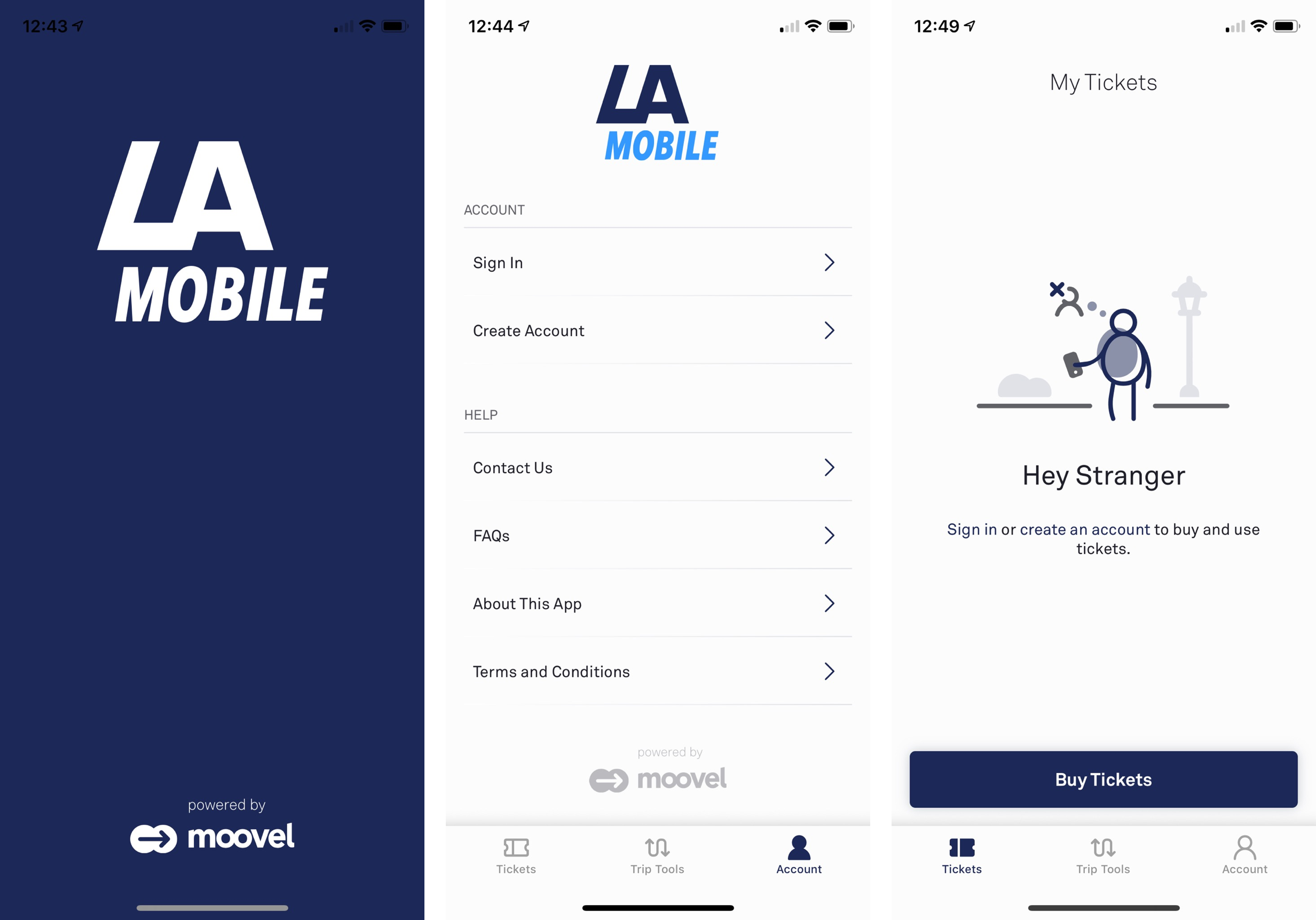
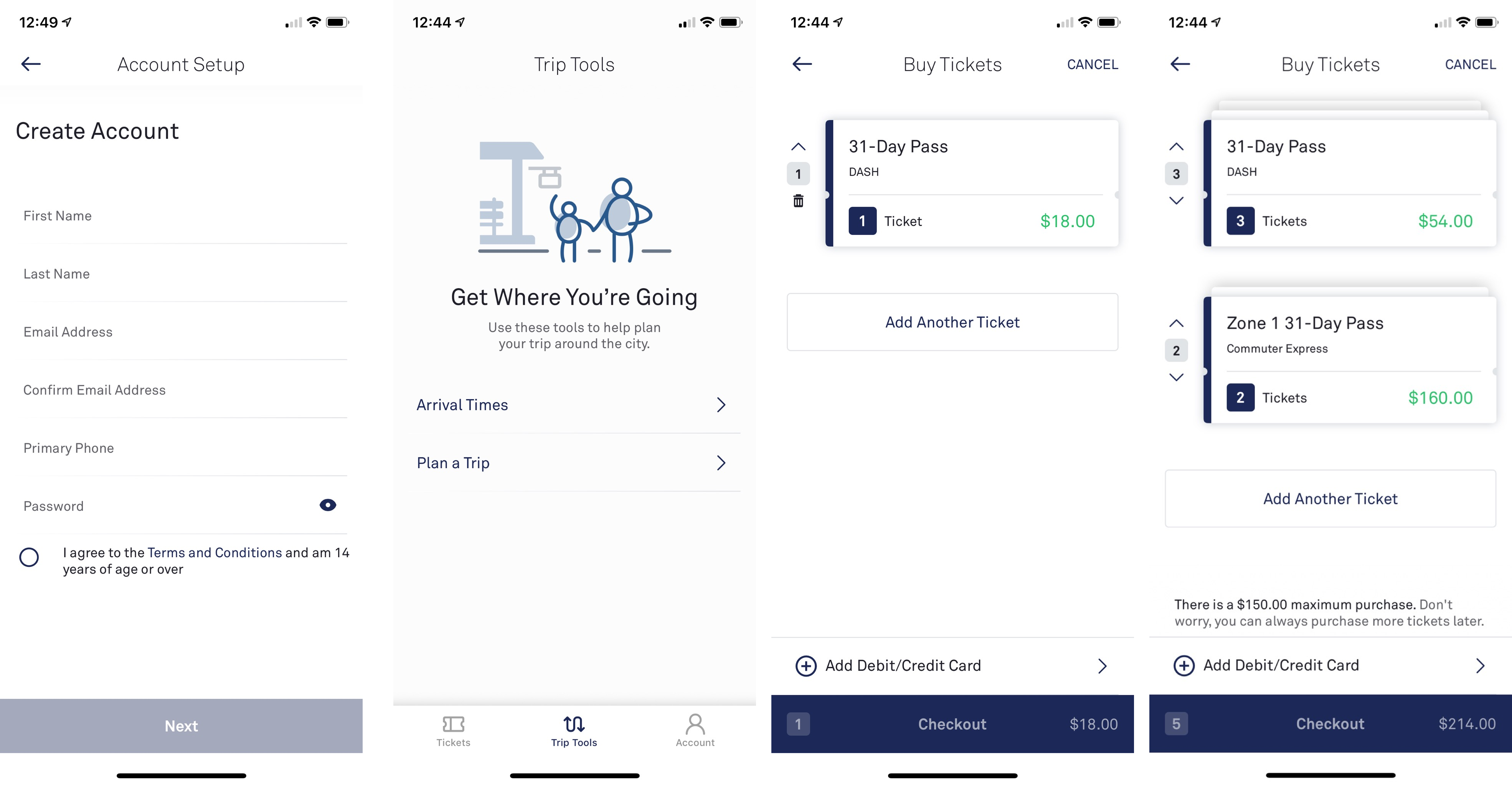
Description: Mobility App is the latest revision of Moovel's flagship Whitelabel Transit App and is native to both iOS and Android. The mobility app had various stages of development, however, I primarily worked on the MVP as Lead UX Designer. The MVP took one year to complete from a research and design perspective and is set to be fully developed and launched in January 2018.
Identifying the existing state of design
Since the Mobility App had already had a couple of Titanium versions as well as preliminary wireframes made on he newest version, I needed to orientate and ground myself quickly.
I studied the existing system maps and wireframes to see where the current team had advanced to. In order to connect with resources that would help me understand the user's, their goals and blockers I aligned with
- the marketing manager for persona creation, brand voicing & user behavior data,
- the customer service manager for insights into customer feedback channels and data &
- the business development team in order to understand the roadmap in relation to which agencies we have partnered with and which ones we are pitching to.
Creating empathy with Customer Service Experts
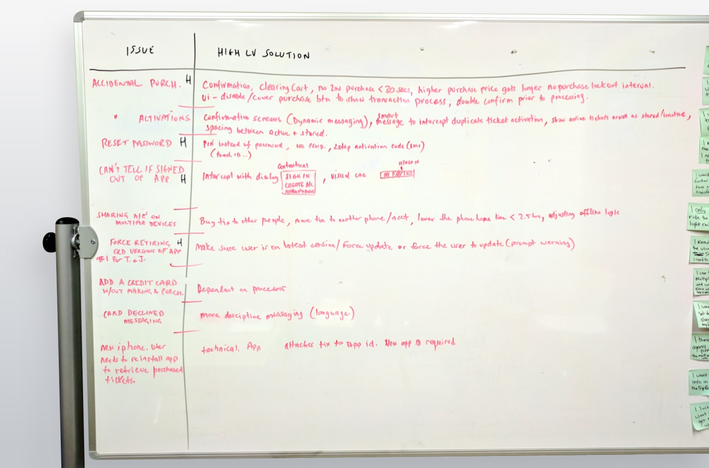
After studying results in our user feedback platform I led a workshop with our Customer Service Team and a local Agency's Customer Service Manager. I wanted to uncover the successes and blockers that users of our current mobility app have from the perspective of Customer Service Representatives. In doing so I created empathy not only for the users but for the Customer Service experts themselves.
The workshop was fairly straightforward and allowed the attendees to identify the 10 main painpoints of feedback that they have experienced being on the front lines with our app users. I then led the discussion into an analysis of context around each of those main themes of feedback as well as to identify any other secondary concerns users have expressed.
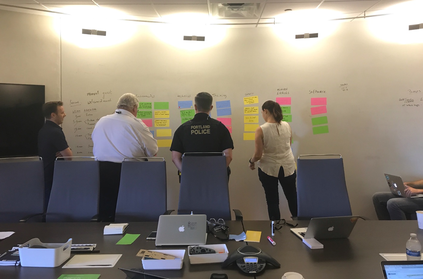
From there I asked them to dot vote the three most important themes of feedback that they believe, if solved, would make the most positive impact long term for our users. This also created a discussion around how the feedback that they would be prioritizing influenced other painpoints the users were having based on relative connections. More influencial feedback might become a higher priority for solution planning since it may, in turn, indirectly solve other customer painpoints.
The 3 highest prioritized feedback themes for each attendee were written on a whiteboard and then each attendee sorted those into a hierarchy of importance. Additionally I asked the group to suggest some high level solutions to each of these feedback themes before we wrapped up the session. I went away, analyzed the results and presented them to my design team.
Understanding the end to end user journey
In order to determine the interactions that a user has with each touchpoint of our brand, I conducted Journey Mapping sessions. Current app users were invited into our office and encouraged to share with me their end to end experience of commuting to work.
In my experience, this is a small section of a larger experience because 'end to end' in relation to a customer journey relates to brand touch points before and after the customers main tasks are complete. Even before a commuter opens our app, or gets on a bus or train, or completes a customer service form, they may have an experience with one of our brand's touch points in the form of advertising, marketing, word of mouth, brand association and much more.
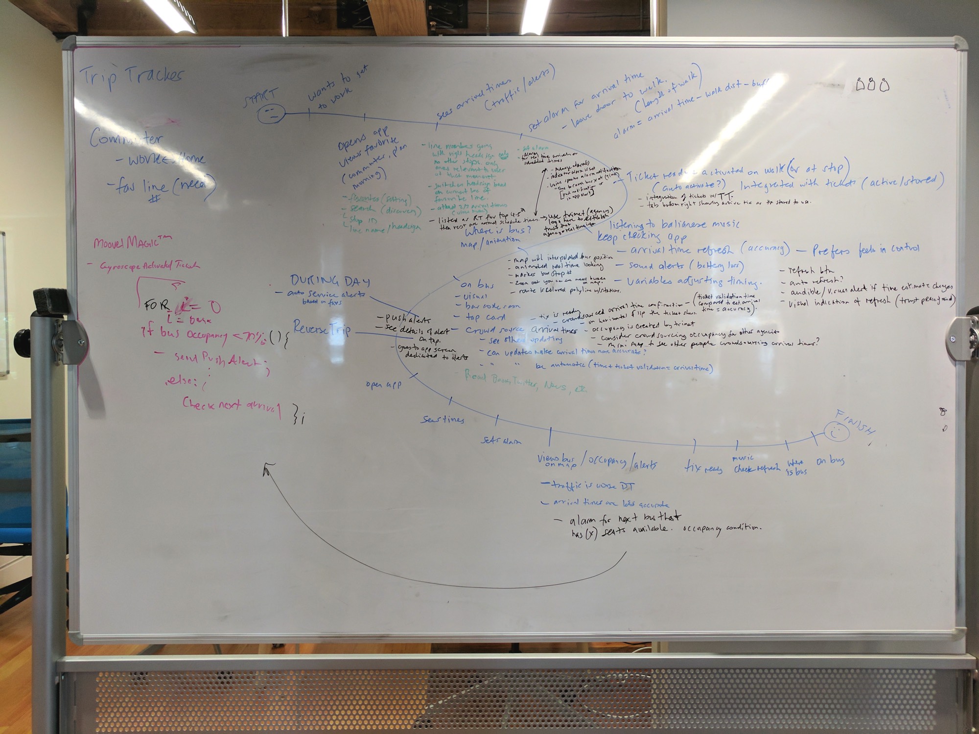
The Journey Map shown follows and records one commuter's experience from an intention to go to work, to returning home at the end of the day to their home. The blue text outlines each action the user takes. The green and black text outlines the details of those actions such as app interactions, suggestions (wants), observations, app screen statuses and user emotions. The emotions are kept at a minimum so that they can be explored more thoughtfully in an Empathy Map.
SWOT's Up?
I wanted to understand what our main competitiors were offering our transit riders so that I could do a SWOT analysis. Armed with the Customer Service Experts feedback and high level solutions, I wanted to see if our competitors were solving the problems our users had while Trip Tracking and Planning transit journeys.
I ran a Competitor Heuristic Evaluation with some co-workers and myself. The Heuristic Evaluation involved assuming some basic commuter scenarios and using each competitor app to achieve preset goals. I instructed my team to capture the results in categories such as "Modes of Transportation, Favorites, Search... etc" while also expressing their opinions and takeaways from their evaluation for each category.
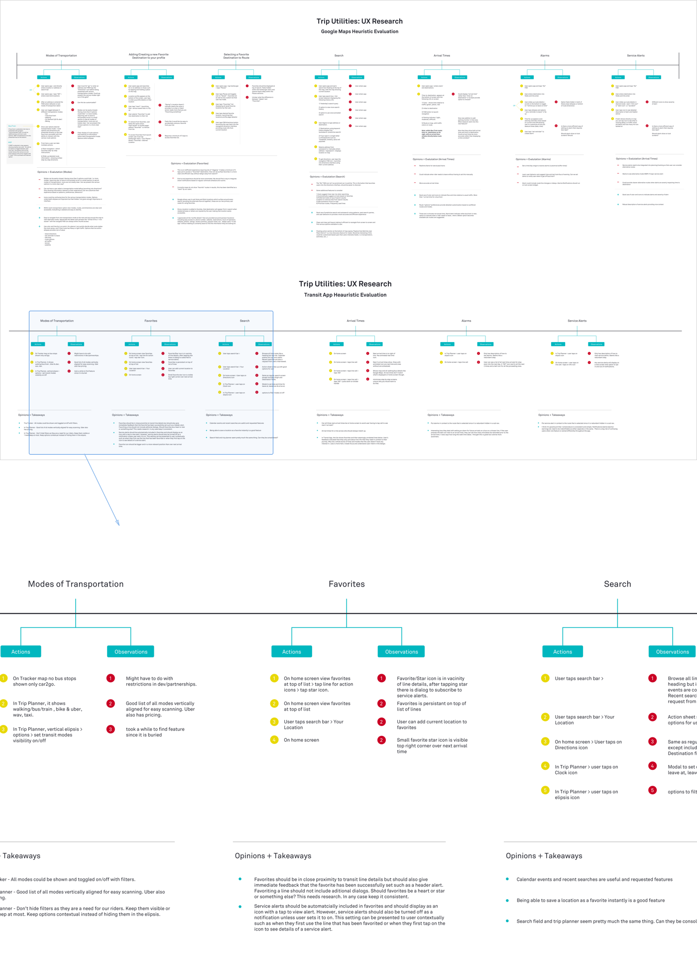
At the conclusion of the exercise I had a map of collected experiences that showed how transit riders would achieve some simple commuting goals while using our competitors products. From this map and my observations, I created a SWOT analysis to identify Strengths (Success), Weaknesses (Blockers), Opportunities and Threats (Initiative). In relation to the transit industry, I tend to consider 'Threats' as motivational and explorative for us rather than letting it take on a negative conotation.
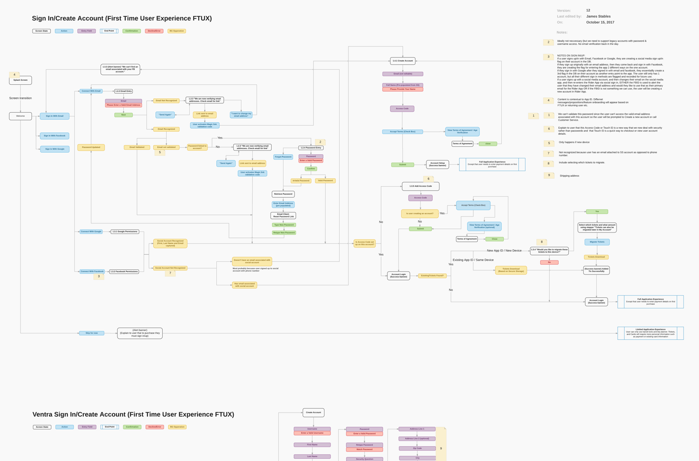
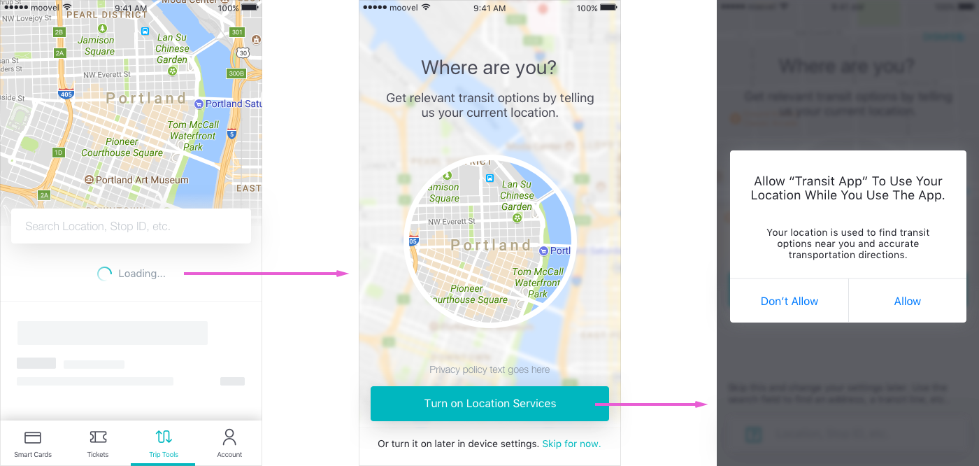
Onboarding as Contextual Guidance
One of our considerations when designing this app was how we would onboard new and existing users to both vital features and permissions. Personally I stand strongly by the use of context when onboarding users to app features. The first run of designs concepts had feature onboarding as a set of screens a user could scroll through or skip before being able to use the app.
After heavily testing this concept and falling back on past experience, it was obvious that the reason why this did not test well was because there was no context to the features being onboarded. As a result, I guided the UI Designer through some alternative concepts based on validating the need to onboard certain features as well as making the ones we do onboard more contextual. In this following example we ask the user to allow permission for Location Services after we show that the maps is empty without knowing where the user is. We use light language to also create a value statement at the crucial time where the user needs to make the decision to grant the permission or not.
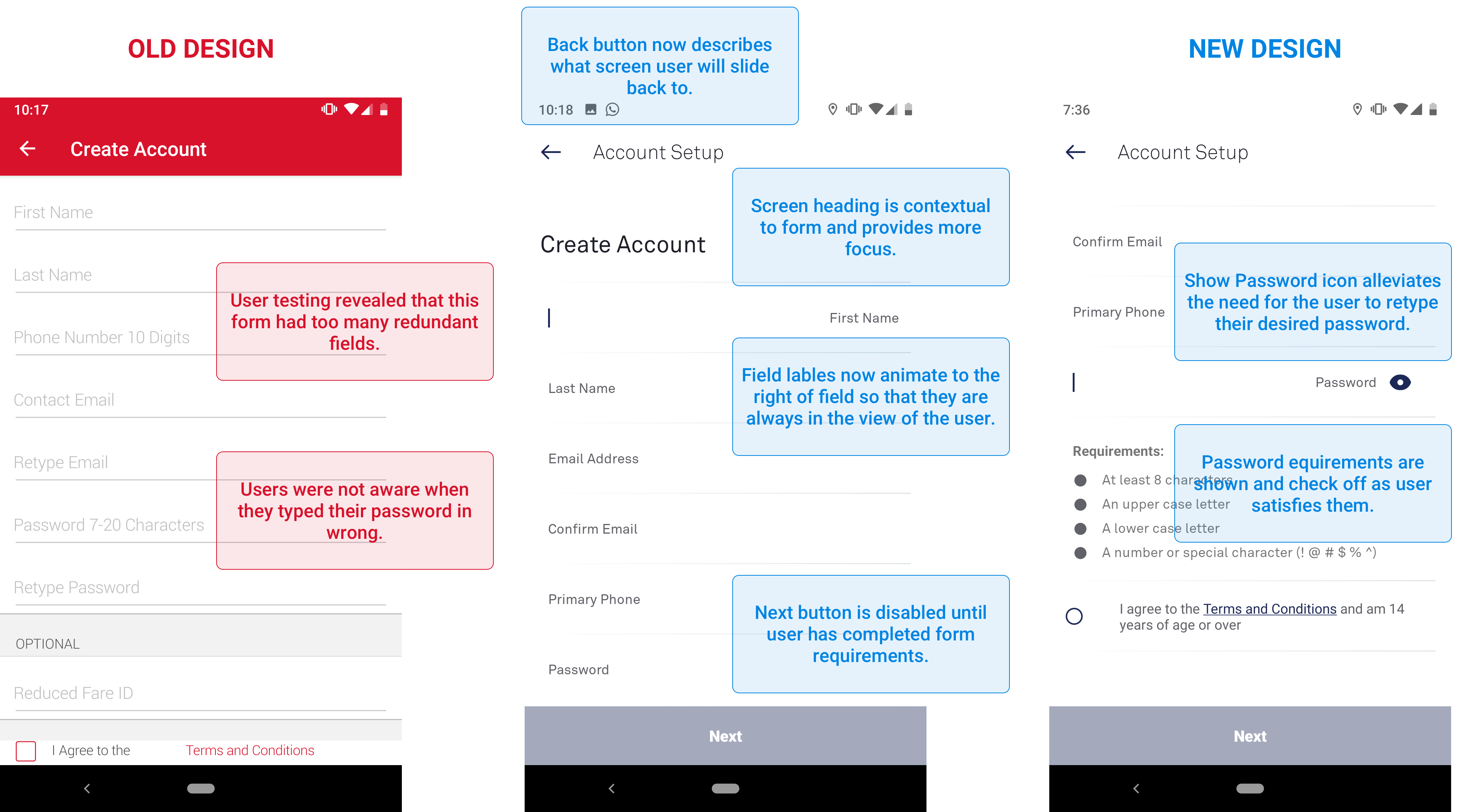
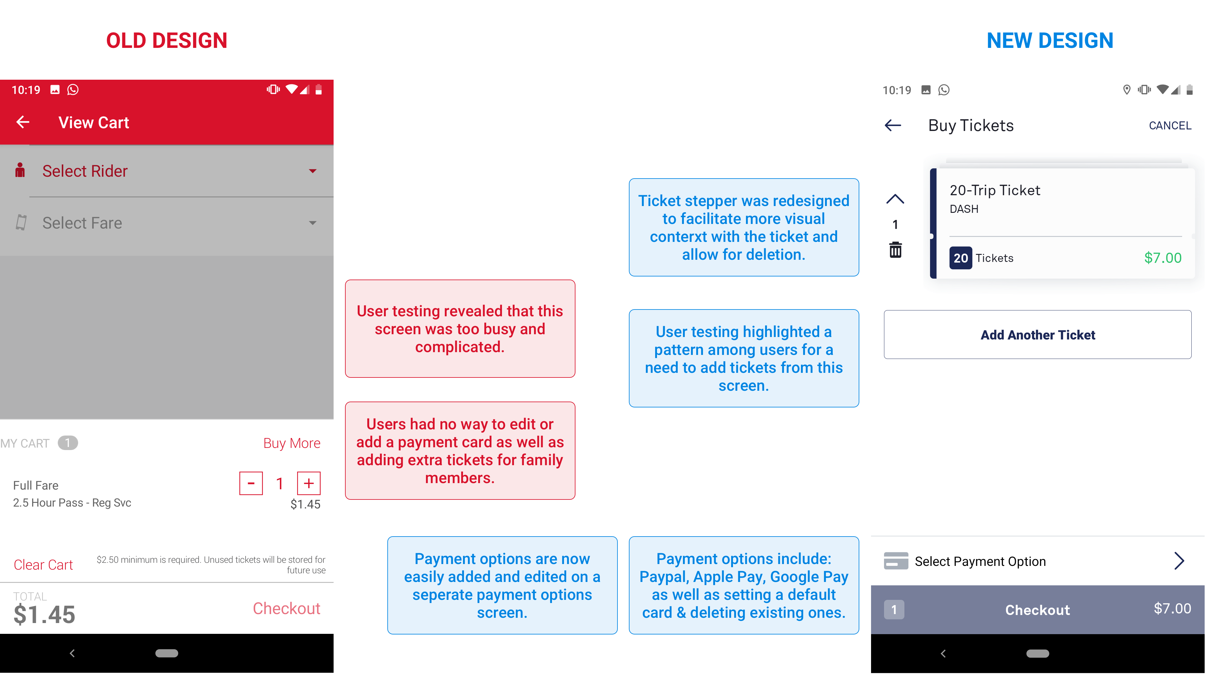
User Testing reveals needs and pain points
User testing was done early and often. From a list of 600 users, I tested our prototypes with around 50 in total both remotely and locally. The data was collected thoroughly in Google Sheets after every session and shared with the design team. I used this data to cross reference what I heard from knowledge experts and created data sheets to discover patterns. The user behavior patterns informed my prototype iterations and design considerations.
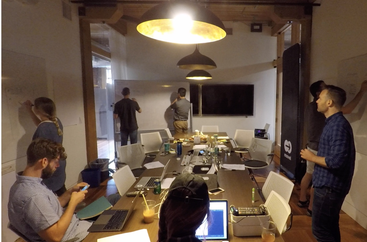
Engineering Engagement
As part of our companywide buy-in plan, we needed to get key stakeholders and engineers involved in critique, guidance and ownership. One way that we managed to successfully engage our company was with Internal Interviews. I sat down with 20 internal stakeholders for 30 min sessions, interviewing and observing them using prototypes depicting transit commuter user flows that I made from data collected in the User Journey Maps.
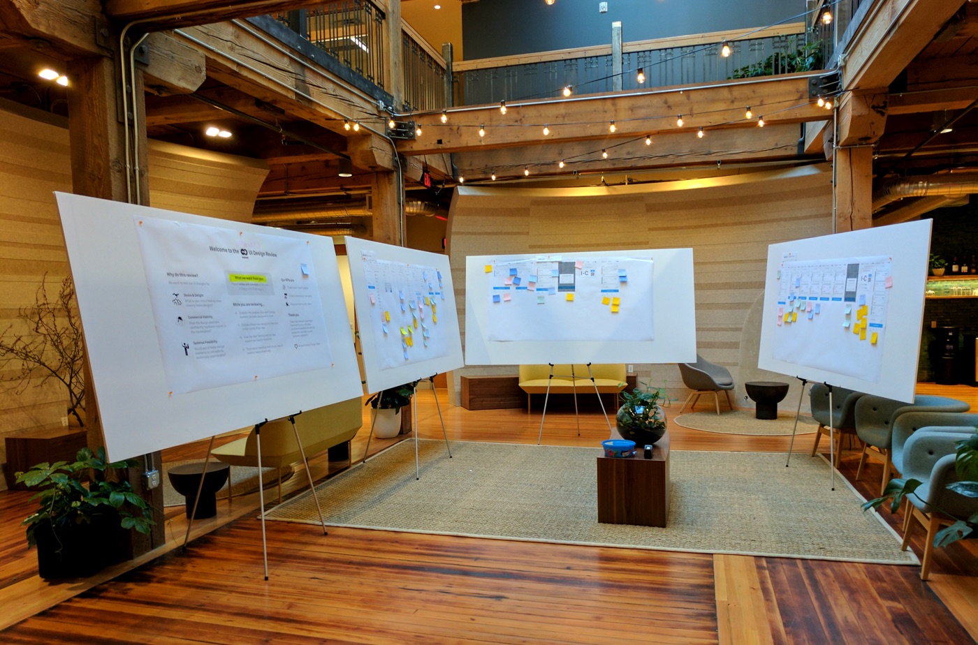
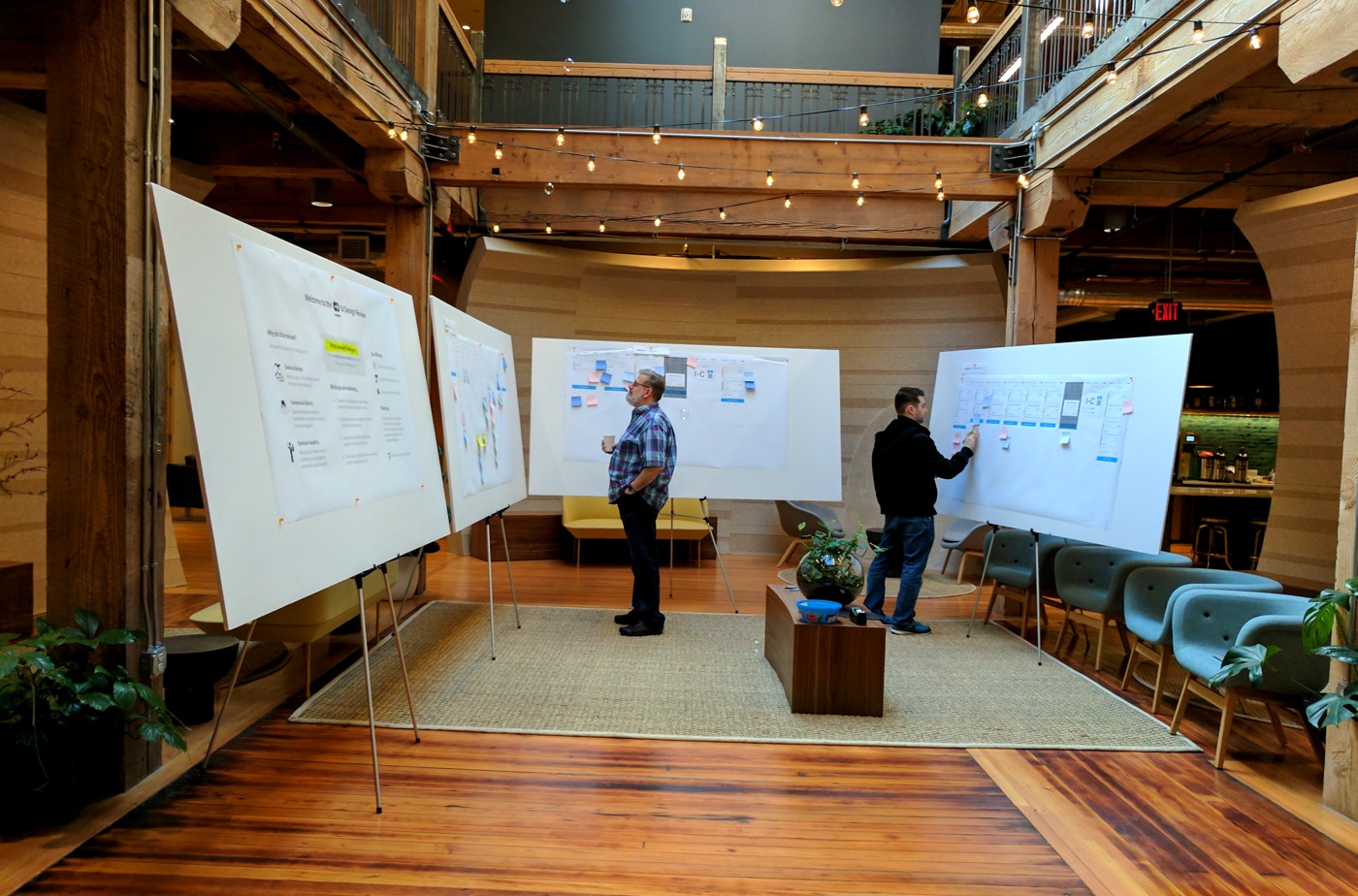
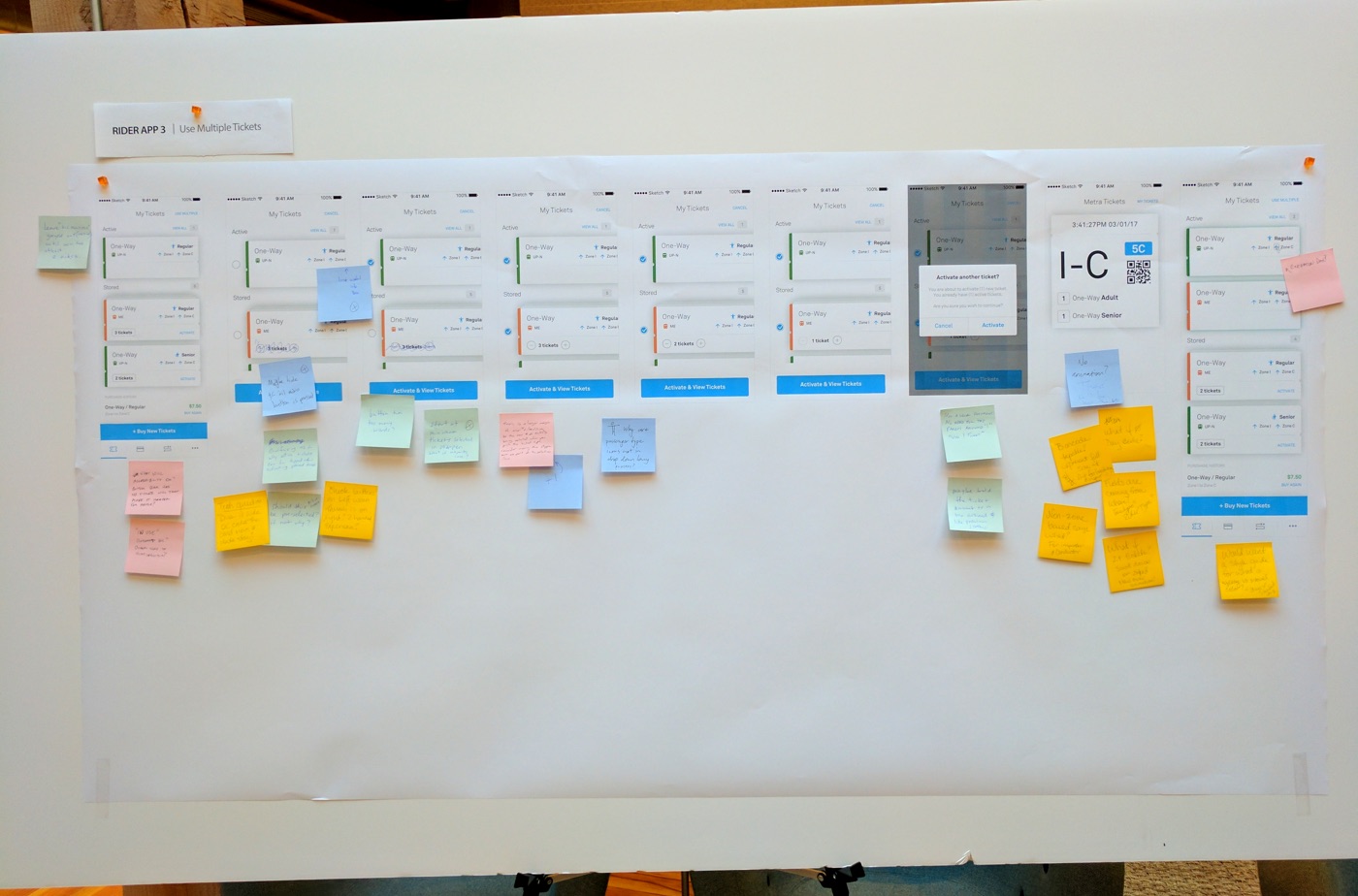
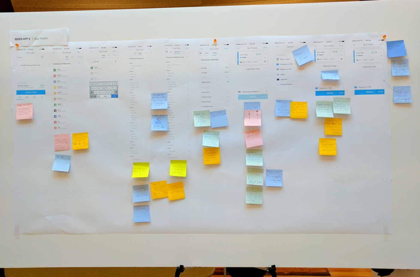
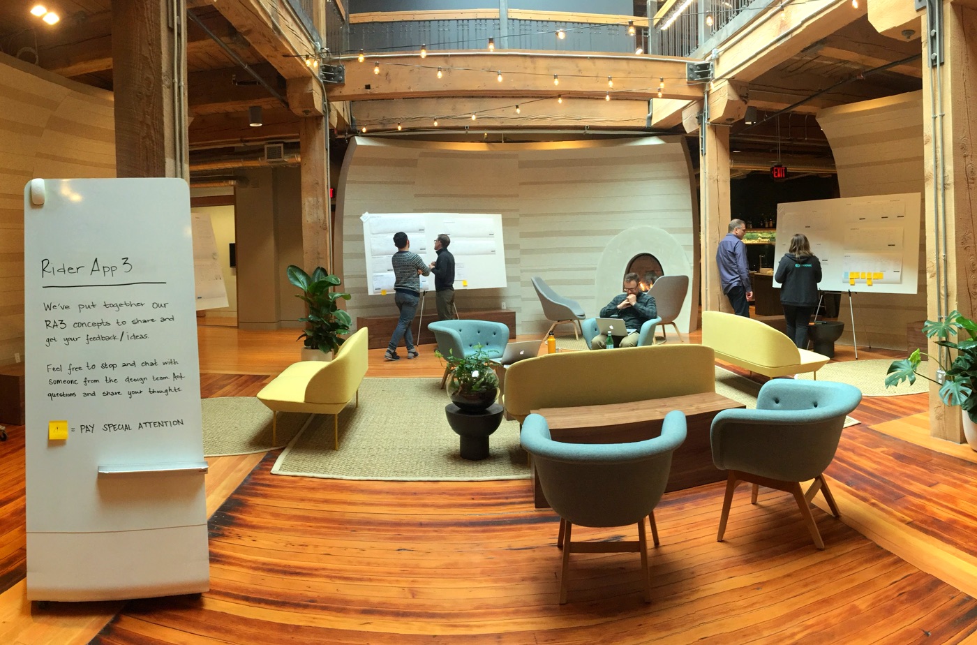
Another successful way that we engaged our company and especially the engineers who would be working on building the new version of the transit app was with a Company Design Review. This entailed setting out design flows based again on the prototypes and User Journey Maps on large foamcore boards in a heavily used area of the office. This means that the company had to walk past our work in order to get to the kitchen during lunch break. As they walked past we would interact with them and engage them in conversation and ideation. It was set up as a trap and was highly effective.
Engineers and key stakeholders were invited to view the design boards separately where we had a dedicated point person to converse and record their thoughts & ideas. Engineers are great at voicing concerns and advice in regard to technical constraints, logical flows, time management when scoping development work as well as innovation, reusable code & best practices.
Let's chat more about this
This case study covers a small section of the overall User Experience Process that I conducted to comeplete this project. I'd love to share more with you on how I conducted and handled user workshops, team dynamics such as feature design retrospectives, design sprints and weekly knowledge sharing. So send me an invite to chat sometime and let's talk shop.